The curse of the big table
As an Area Editor for Pattern Recognition Letters, I’m frequently confronted with papers containing big tables of results. It is often the deblurring and denoising papers that (obviously using PSNR as a quality metric!) display lots of large tables comparing the proposed method with the state of the art on a set of images. I’m seriously tired of this. Now I’ve set my foot down, and asked an author to remove the table and provide a plot instead. In this post I will show what is wrong with the tables and propose a good alternative.
I’m just taking a random denoising/deblurring paper as example. It has four tables like this one:
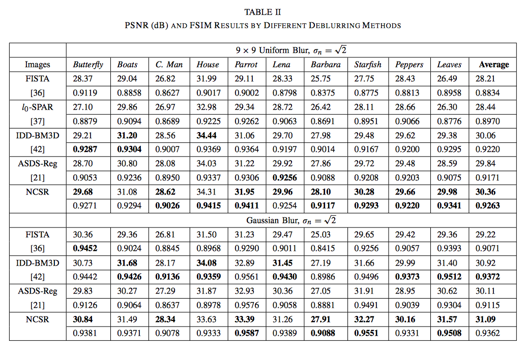
The main problem with this table is that it doesn’t allow comparison of the various methods without looking at each column individually, study the numbers in it, and determine the magnitude of the difference between the largest value and all other values. Very helpfully, the largest value has been bolded. But it is still not a trivial task to determine how significant the advantage of one method over the other is. To further complicate things, PSNR and FSIM values have been mixed in the same column (presumably to save space), meaning that you need to compare odd rows and even rows separately.
In short, the raw dumping of numerical results helps no-one, except maybe the authors, who are able to hide the insignificance of the improvement of their proposed method. The purpose of a scientific paper is to communicate research results, not to let the reader repeat all your calculations. Raw data has no place in a scientific paper (of course there are always exceptions), the author should strive towards explaining his/her findings as simply and compactly as possible. In the same way that long, flowery prose is to be avoided, so are long, flowery displays of data.
For example, how many readers are interested in seeing the value of the PSNR obtained when applying the new algorithm to the image ‘Boats’? Very, very few is my guess. It might be nice to provide the raw results as supplementary data, so that other people can use those values in their own comparisons (but better, of course, is to provide the code so others can replicate the experiments). The majority of the readers will want to compare the results of the new algorithm to the previous state-of-the-art. Why not help them do this?
I would propose to display these results using a box plot:
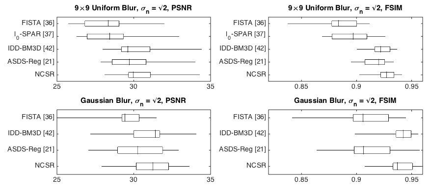
In this plot we can directly compare the various methods against each other. I have separated the two metrics into separate plots, and the whole display still occupies less space than the one table. If strapped for space, it would be possible to remove two of the x-axes and two of the y-axes, and bring the four boxes close together.
One problem with this plot is that the distribution displayed by the boxes (especially in the case of PSNR) is driven by the images themselves, more than by the method. Thus, overlap between these boxes has no meaning other than saying that PSNR is a poor metric for evaluating this type of method. An alternative solution is to plot the improvement of the method over each of the state-of-the-art methods:
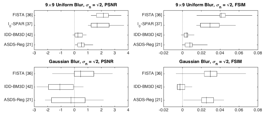
I have simply plotted the difference between the results for the new method and each of the other methods. PSNR is a logarithmic measure, so this makes sense, but for the other measure it might make more sense to plot ratios. In any case, it is now clear that the method improves in most cases, but not in all, and it is easy to see which cases these are.
Edit
I did not discuss here the other issues with this type of analysis: PSNR values depend very heavily on image content and should not be used for comparison across images. Are 10 images representative? Why not use all images in, for example, the Berkeley Segmentation Data Set, a collection of 500 natural images? Why are there not many different levels of blur compared? With how much blur does the method finally break down? Etc. Etc.
Edit 2
If you are curious about how I made these plots, you can
find the script here. The boxplot command is one I wrote myself,
find it on the MATLAB File Exchange.