Color maps for image display
Today’s post discusses different possible color maps you can use to display a scalar image (i.e. an image with a single channel, often referred to as a grayscale image). A color map is necessary to translate the pixel values of the image into colors to show on the screen. When using a grayscale color map, each pixel is represented by its own gray value. More colorful color maps are often employed to either make the display more attractive, to enhance our ability to distinguish specific values, or to highlight specific transitions. Unfortunately, many color maps in frequent use also distort the image we perceive.
There are four general categories that I’ll cover in turn: the grayscale color map, rainbow color maps, linear (or sequential) color maps, and special-purpose color maps.
The grayscale color map
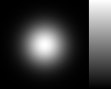
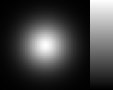
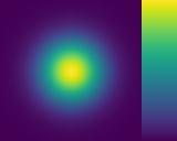
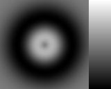
This is an obvious choice, considering we’re displaying a grayscale image. And it usually is the choice I make when working with arbitrary images. It gives me the best ability to judge the shape encoded by the image data. For example, the first image here is a Gaussian blob; I can recognize it as such from the image. Next is a Gaussian with a clipped peak; again I can tell the peak is flat. Finally, a blob with a different shape; it is immediately apparent to me that this is not a Gaussian, that its tail is heavier than that of a Gaussian and its peak is sharper.

Some image display tools will use the grayscale color map by default for grayscale images. But some prefer a more colorful color map as the default. For example Matplotlib uses “viridis” by default. This is a perceptually uniform linear color map (more on that below), so not a terrible choice, but I think it causes more confusion among novices than the grayscale color map.
Note that a properly configured display is required for the grayscale color map (or any other color map) to produce a useful image on the screen. Modern displays, straight from the factory, are much more likely to show the expected intensities than the old cathode ray tubes. We don’t need to calibrate display gamma anymore. But for proper color perception one still needs to use the display in a properly illuminated environment, and calibrate the display’s colors to that environmental illumination. This means that when we limit ourselves to grayscale, the image will likely look the same on any modern display, but when using color, different uncalibrated displays might show different things.
Rainbow color maps
Much has been written about the problems with the rainbow color maps. See for example Borland and Taylor [1], and the references therein. The main arguments are:
- No natural ordering to the colors: does red represent a larger value than green or a smaller one?
- Not perceptually uniform: at some points, the color map has too much contrast, at others it doesn’t have much at all. This means that some image features can be hidden, and some artificial features can appear.
- Some colors, such as yellow or cyan, appear brighter and therefore draw more attention than other colors.
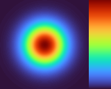
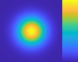
Here is the Gaussian from before with MATLAB’s “jet” color map applied:
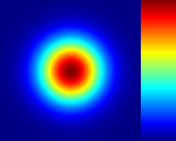
Besides the main points argued above, the peak of the Gaussian is a lot darker than other parts, to me the shape for this blob is a donut, not a simple peak.
Still, this has not stopped people from using them. Rainbow color maps are still used frequently (though luckily much less frequently than in the past). And because of that, some people have attempted to improve on them to reduce some of their worst properties. In particular, I’m aware of these modern rainbow color maps:
- ColorCET rainbow color maps by Peter Kovesi (2015),
- batlow color map by Fabio Crameri (2018), and
- turbo color map by Anton Mikhailov (2019).
ColorCET is a large collection of color maps, produced with methods described in a paper [2]. There is a lot we know about perception of color, which can be translated into perceptually-uniform color maps. Now, a rainbow color map can never be perceptually uniform, but the ones in ColorCET are certainly much better approximations.
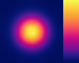
Likewise, “batlow” comes from a larger collection of color maps also produced according to scientific principles [3]. In contrast, “turbo” was created by eye-balling something that looked good to its author. Here is the Gaussian again, with the three color maps applied:
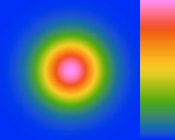
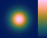
None of these is an ideal representation of the data. “Batlow” comes closest, though it also is the least like a rainbow color map. In fact, I think it belongs more to the next section, since its intensity increases from dark to light. But it is sold as a rainbow color map by its author.
We see that the ColorCET rainbow color map solves some of the problems of older rainbow color maps, though it still produces rings where none exist in the data. It’s author refers to it as “the least worst rainbow colour map I can devise.”
“Turbo” is more uniform than “jet”, but it still keeps the problem of high values having dark colors. It is the only one of the three that makes the peak look like a donut. To me, this is by far the worst of the batch. Guess which one of these color maps is built into MATLAB and Matplotlib and a whole lot of other tools? That’s right, “turbo” is! Its author works at Google, and published it on the Google Research blog, and that is of course much more important than understanding the science, or the color map actually being any good.
The advantage of rainbow color maps over grayscale or linear color maps is that one can name the colors, which makes it easier to look them up in the reference or compare them across images. On the downside, these clearly identifiable colors introduce cognitive plateaus (even if perceptually they are not).
Linear (or sequential) color maps
To add color to a grayscale image in a proper way, one needs to devise a color map that doesn’t fall in any of the pitfalls of the rainbow color map. Having the lightness (intensity) of the colors increase linearly from dark to bright does several things. First of all, it introduces a unique, intuitive ordering to the colors. Additionally, it allows the figure to be printed in black-and-white, and still maintain its properties. Next, we want to change the hue from one color to another, sometimes through a third color. Doing so in a perceptually uniform manner is not trivial, but we understand enough about color perception that such a transition can be computed.
The main reason to add the hue in this case is to improve the intensity resolution; color improves our ability to see small differences in intensity without reducing the range of intensities displayed.
Many authors have proposed manually-generated color maps approximating perceptual linearity. But, as far as I know, the first such color maps generated algorithmically using color perception theory were Peter Kovesi’s ColorCET [2]. Matplotlib also introduced several such color maps, its default is “viridis”. Some years later, MATLAB introduced the “parula” color map as its new default.
Here is the Gaussian with these three color maps (I picked my favorite from the ColorCET collection):
It is clear that “parula” is the inferior of the three here, with quite a strong orange band. But none of them allow me to recognize the shape as well as the grayscale color map. Granted, I have a lot of experience looking at images (and in particular Gaussian blobs) displayed with a grayscale color map. Would I be able to see the Gaussian shape equally clearly with one of these color maps if I had the same level of experience looking at images displayed with that color map? Maybe!
Special-purpose color maps
Color can do a lot more than improving out ability to discern small differences in intensities. We can also use it to label distinct intensity ranges. Below are three examples.
Cyclic color maps
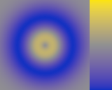
If the image’s intensities represent angles, we want the color for 360° and 0° to be the same. This requires a cyclic color map (i.e. it must be periodic).
Let’s take as an example the angle of the gradient of the Gaussian image used above. When using a grayscale color map, it has a sharp transition at 180° (the angle computed is in the range of -180° to 180°). Using one of the cyclic color maps from ColorCET, the sharp transition is no longer there.
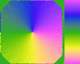
We can now identify green as 0°, yellow as 90°, magenta as 180°, and blue as -90°.
Divergent color maps
Similarly, when the sign of the image intensities is relevant, we can represent negative values with a different color from positive values. In this case, our color map is two linear color maps, both start at the same color (usually gray, black or white) for 0, and have increasingly bright and/or saturated colors for larger magnitudes.
I experimented with these divergent color maps in a post many years ago. This was before the ColorCET color maps were published, and before I learned the little bit I know now about color perception.
For example, this is the difference between the Gaussian blob and the heavy-tailed blob we displayed earlier:
The neutral gray when using the diverging color map indicates where zero is.
Sharp transitions
Sometimes one specific gray value is important to highlight. For example, this satellite image represents surface height. It is really hard to see what part of the world is represented, unless we know what we’re looking for:
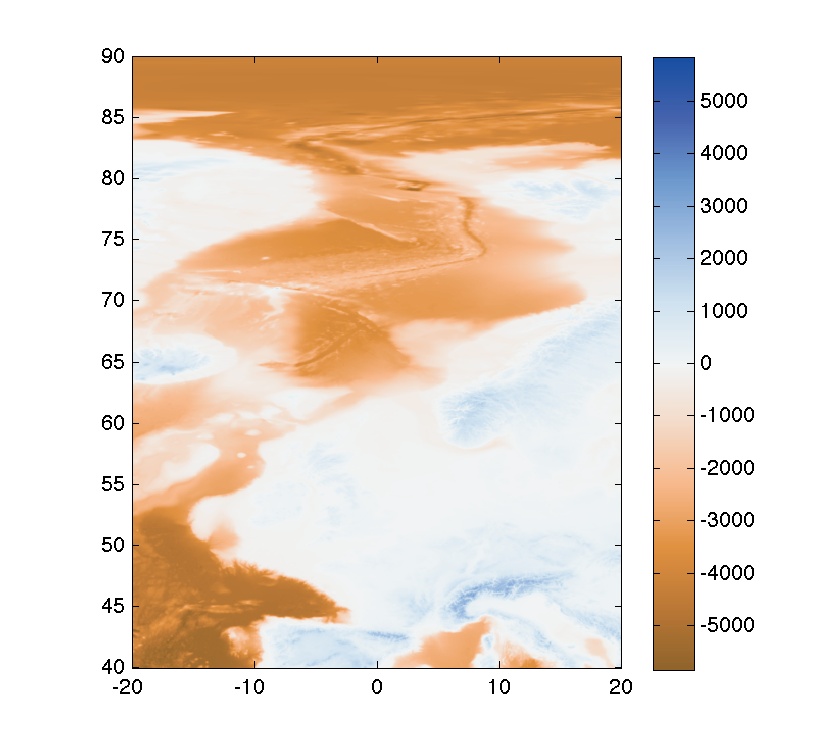
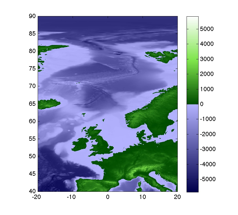
Using a color map with a jump at height of 0, coloring negative values with different colors from positive values, the outline of land mass becomes immediately obvious, and anyone will be able to recognize, without difficulty, what part of the world was imaged:
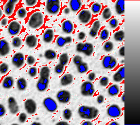
Another example is the color map often used on microscopes (especially fluorescent microscopes) where pixels with a value of 0 are shown in blue, and pixels with a value of 255 are shown in red. The blue pixels thus indicate underexposed pixels, and red ones overexposed pixels. The operator can then adjust gain and offset to reduce these blue and red pixels as much as possible. Here’s an example of an image with this color map applied:
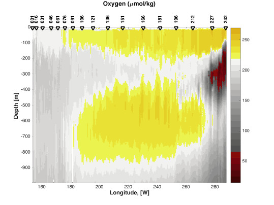
Finally, this is a nice example from this page, where a grayscale color map is enhanced to highlight regions where oxygen saturation is too high or too low. The color map has yellow and red colors for these regions:
Conclusion
So, for me, the go-to color map will always be the grayscale color map. It is what best allows me to recognize the shape formed by the image intensities. To see smaller intensity differences, the first thing I do is change the intensity range that is mapped to the black-white range on the screen. Of course this cannot be done in a publication, where interaction with the display is typically not possible.
Adding color can improve the resolution of the color map, and it can also highlight specific values. For signed difference images I typically use a diverging color map, where 0 is recognizable and the hue encodes the sign. And for angles I typically use a 4-color cyclic color map, where each cardinal direction has a specific color we can name. But it is important, in all these cases, that the color map be perceptually uniform, otherwise we will distort our perception of the data (of course sometimes we might want to lie about our data, which is possible to do with non-uniform color maps).
Finally, in some very specific cases, one might want to build a custom color map specifically designed to highlight some chosen intensities. But this is something one would do for publication, not for data exploration.
Literature
- David Borland and Russel M. Taylor II, “Rainbow Color Map (Still) Considered Harmful”, IEEE Computer Graphics and Applications 27(2), 2007 [DOI] [PDF]
- Peter Kovesi, “Good Colour Maps: How to Design Them”, arXiv:1509.03700 [cs.GR], 2015
- Fabio Crameri, “Scientific colour maps”, Zenodo, 2018 [DOI]
Questions or comments on this topic?
Join the discussion on
LinkedIn
or Mastodon