How did this get published?
“How did this get published?” is a question I regularly ask myself when reading new papers coming out. I just came across another one of these jewels, and because the topic is that of a previous blog post here, I thought I’d share my frustration with you.
The paper is entitled “On Perceptually Consistent Image Binarization” (IEEE Signal Processing Letters 20(1):3:6, 2013), which leads one to believe that this is an interesting paper related to segmentation or thresholding and visual perception. The abstract, however, helpfully lets us know this is about error diffusion. And it promises a strong theoretical foundation leading to perceptually consistent halftone images. I previously wrote about error diffusion here, so let’s look at what they did.
The introduction doesn’t start very strongly:
Of various image binarization methods, error diffusion is a popular one and has been widely used in image printing and display applications [6]. It was firstly introduced by Floyd and Steinberg and lately some other variations have also been proposed.
And that is it, no review whatsoever of the later variations. This is troubling, because this typically means that they will only compare their new method to that very first method, and ignore all of the literature that came after. If you read my previous blog post, you’ll know that error diffusion was introduced in 1975. That is nearly 40 years of research that these authors are pretending never happened!
The proposed scheme turns out to be the same as Floyd-Steinberg, but they also suggest the use of a larger window, as Jarvis, Judice and Ninke did in 1976. Thus, this is a paper proposing yet another set of weights for the standard algorithm. The promised theory is quite funny too, if you’re only somewhat familiar with diffusion. They start with heat exchange (this is basic diffusion), and somewhere propose that
Then, the amount of heat exchanged between the current pixel and its neighbours in unit time is in proportion to the reciprocal of their distances, that is .
This comes out of nowhere, without references or proof, of course. And we all know that the solution to the heat equation (basic, isotropic diffusion) is a Gaussian. That is, heat exchanged between two points is proportional to . The weights proposed are given only as an equation, and they demonstrate with 4 neighbours (as did Floyd-Steinberg) or with 10 (two neighbours less than Jarvis-Judice-Ninke).
Now comes the kicker! The experimental results is always the place where I get most frustrated. Apparently we don’t teach how to do science any more. This is the most important part of our jobs, but instead most papers in image processing use the experimental results section to show the extent of our ineptitude. Worse even than I feared, the “new” method is compared to thresholding! This is the first paragraph of the results section:
To evaluate the performance of the proposed scheme, experiments are implemented. [wow! how clever!] Partial results on some test images are given in Figs. 3–6, where Fig. 3 are the original test images, Fig. 4 shows the binarized results of traditional fixed-threshold scheme, Figs. 5 and 6 are the results of the proposed scheme with ds=√2 and ds=√5 [these are the two neighbourhood sizes] by using raster scan order, respectively. From the results one can see that, compared with the traditional fixed-threshold scheme, the visual quality of the binarized images with our scheme can be greatly improved. [!!!]
They are actually saying that visual quality of error diffusion is better than that of thresholding!
The next paragraph compares, visually, on 4 images, the result of the “new” method with those of Floyd-Steinberg (1975) and Jarvis-Judice-Ninke (1976), leading to the conclusion that it is difficult to tell the difference between the methods (guess why!). Sadly, the authors chose not to show the results of these old methods on two of the images that they showed in the previous paragraph. This probably means that these images looked better with the old methods! Finally, the third paragraph of the experimental section does an “objective” comparison, with actual numbers. They blurred the dithered images and compared them with the original images using the PSNR measure. Of course, as I wrote before, the PSNR measure is pointless. But what is worse is that the differences with Jarvis-Judice-Ninke are mostly insignificant: 28.018 vs 28.079, etc.
To further embarrass themselves to the readers of this blog, they blurred the image by filtering “three times with the 3×3 Gaussian low-pass filter.” As you all know, repeated applications of the Gaussian filter are equivalent to a wider Gaussian filter, and 3×3 pixels is not enough to correctly represent a Gaussian filter. I am afraid that these people fell into the trap put in front of them by MATLAB, which by default generates a 3×3 mask for a Gaussian filter.
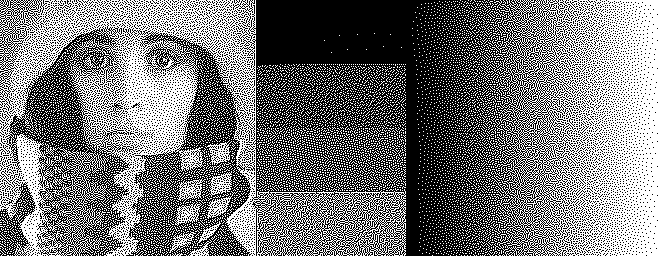
I’ve run the algorithms with the proposed weights on the test image I used previously. These are the results:
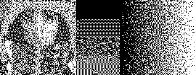

I’ll copy the Floyd-Steinberg (1975), the Zhou-Fang (2003) and the Chang-Alain-Ostromoukhov (2009) results from the previous post for comparison:


How did this paper get published?